
In the ever-evolving landscape of financial markets, the pursuit of smarter trades is a constant endeavor for investors and traders alike. While intuition and gut feelings can play a role, informed decision-making hinges on a robust understanding of market dynamics. This crucial understanding is cultivated by effectively evaluating market strength, a process that allows us to discern whether an uptrend is building genuine momentum, a downtrend is poised for further decline, or if the market is simply oscillating within a range. Relying on a single indicator or a simplistic approach can lead to costly mistakes. Instead, a sophisticated trader employs a multi-faceted strategy, weaving together various analytical tools to paint a comprehensive picture of the prevailing market sentiment and the sustainability of current price action. This article delves into the key indicators and methodologies that empower you to assess market strength, ultimately guiding you towards more informed and potentially more profitable trading decisions.
Market strength is not a static concept; it’s a dynamic reflection of the cumulative forces of supply and demand, influenced by investor psychology, economic news, and global events. For a trader, identifying and quantifying this strength is paramount. It’s the difference between riding a powerful wave and struggling against choppy waters. A robust assessment of market strength allows you to:
Why Evaluating Market Strength is Crucial
The financial markets are inherently probabilistic. No strategy can guarantee a win, but a disciplined approach to evaluating market strength significantly increases the odds of success.
Identifying Sustainable Trends
A strong market exhibits clear directional movement. Recognizing the underlying strength of an uptrend, for instance, allows you to confidently participate in it, rather than being whipsawed by minor corrections. Conversely, understanding the conviction behind a downtrend can help you avoid buying into a falling knife.
Avoiding False Signals
The market is rife with noise and deceptive price movements. Strong indicators act as filters, helping to distinguish genuine directional conviction from ephemeral fluctuations. This is particularly important in volatile periods where price action can appear erratic.
Improving Risk Management
By understanding the strength of a trend, you can better position yourself in the market and set appropriate stop-loss orders. A strong trend generally offers more room for price movement before trend exhaustion, allowing for wider stops in certain situations, while a weak or consolidating market might necessitate tighter risk controls.
Enhancing Entry and Exit Points
Knowing that a market has strong upward momentum might encourage earlier entries or holding positions for longer. Conversely, signs of waning strength can signal the opportune time to take profits or exit a trade before a reversal.
In the pursuit of making informed trading decisions, understanding market strength is crucial, and a related article that delves deeper into this topic is “Understanding Market Dynamics: A Comprehensive Guide.” This article provides valuable insights into various indicators that can help traders assess market conditions more effectively. For those interested in exploring this further, you can read the article here: Understanding Market Dynamics: A Comprehensive Guide.
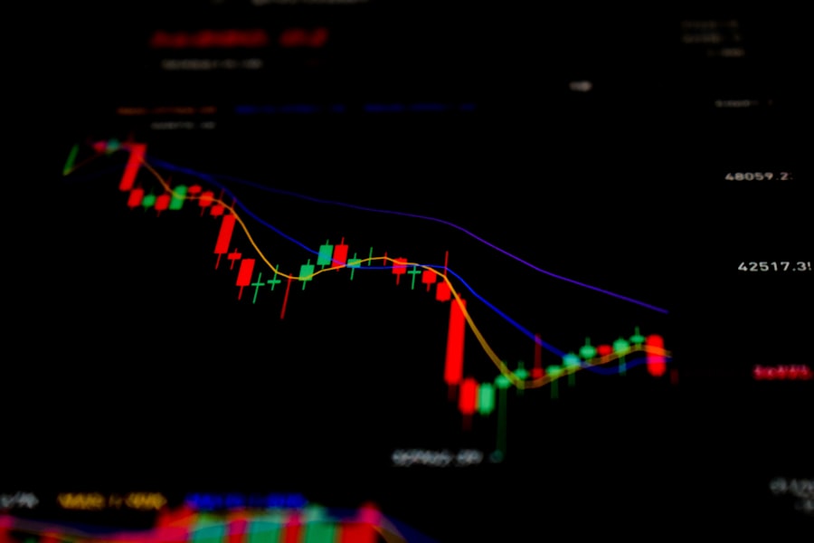
Momentum Indicators: Gauging the Speed and Intensity of Price Moves
Momentum indicators are the bedrock of market strength assessment. They measure the pace of price changes, providing insights into how quickly a market is moving in a particular direction and whether that movement is accelerating or decelerating. These tools are central to identifying potential overbought or oversold conditions, which often precede trend exhaustion or reversals.
Relative Strength Index (RSI): The Popular Oversold/Overbought Gauge
The Relative Strength Index (RSI) is a widely used momentum oscillator that measures the magnitude of recent price changes to evaluate overbought or oversold conditions. It oscillates between 0 and 100.
Interpreting RSI Levels
- Overbought Conditions: An RSI reading above 70 is generally considered overbought, suggesting that the asset may be due for a price correction or pullback.
- Oversold Conditions: An RSI reading below 30 is generally considered oversold, indicating that the asset may be due for a price bounce or recovery.
- Divergences: A key aspect of RSI analysis is divergence. Bullish divergence occurs when the price makes lower lows, but the RSI makes higher lows, suggesting that downward momentum is weakening. Bearish divergence happens when the price makes higher highs, but the RSI makes lower highs, indicating that upward momentum is fading.
RSI and Market Strength
While overbought and oversold levels are important, in a strong uptrend, the RSI can remain in overbought territory for extended periods. Conversely, in a strong downtrend, it can stay in oversold territory. Therefore, it’s not just the level, but how the RSI behaves in relation to price that provides valuable insights into market strength. A sustained move towards extremes, coupled with price continuation, indicates robust momentum.
Moving Average Convergence Divergence (MACD): Trend and Momentum Synthesis
The Moving Average Convergence Divergence (MACD) is a trend-following momentum indicator that shows the relationship between two moving averages of a security’s price. The MACD is calculated by subtracting the 200-day Exponential Moving Average (EMA) from the 12-day EMA.
Understanding MACD Components
- MACD Line: The difference between the 12-period EMA and the 26-period EMA.
- Signal Line: A 9-period EMA of the MACD line.
- Histogram: The difference between the MACD line and the signal line, plotted as bars.
MACD for Trend Confirmation
- Bullish Crossovers: When the MACD line crosses above the signal line, it’s generally considered a bullish signal, indicating increasing upward momentum. In a strong uptrend, these crossovers are frequent and precede significant price gains.
- Bearish Crossovers: When the MACD line crosses below the signal line, it’s a bearish signal, suggesting decreasing upward momentum or increasing downward momentum.
- Divergences: Similar to RSI, MACD divergences can signal potential trend reversals. Bullish divergence occurs when price makes new lows, but MACD makes higher lows. Bearish divergence occurs when price makes new highs, but MACD makes lower highs.
MACD and Sustained Momentum
A MACD that remains above the zero line and shows the MACD line consistently above the signal line, with a growing histogram in the positive territory, is a strong indicator of sustained upward momentum. The opposite is true for a strong downtrend.
Volume Analysis: The Underrated Power of Participation
Volume is the heartbeat of the market. It represents the number of shares or contracts traded during a specific period. Without sufficient volume, price movements can be considered suspect. High volume accompanying a price move indicates broad participation and conviction, making that move more likely to be sustained. Low volume, on the other hand, can suggest a lack of conviction and a higher probability of a reversal or continuation failure.
Volume Confirmation in Trend Continuation
The principle here is straightforward: a genuine trend requires consistent buying pressure (in uptrends) or selling pressure (in downtrends) to sustain itself.
Volume During Breakouts
A breakout from a consolidation pattern or a key resistance/support level is significantly more reliable when accompanied by a surge in volume. This indicates that market participants are actively taking positions in the direction of the breakout. A breakout on low volume is often a sign of a false move.
Volume During Trend Advances and Declines
In a healthy uptrend, volume typically increases as prices rise and decreases during pullbacks. This pattern demonstrates that while buyers are enthusiastic during price appreciation, they become more cautious during minor retracements. Conversely, in a strong downtrend, volume tends to be higher on down days and lower on up days.
Volume Divergences and Warning Signs
Just as with momentum indicators, volume can also exhibit divergences that signal potential changes in market strength.
Declining Volume on Up Moves
If an asset is making new highs but with progressively lower volume on those upward moves, it can suggest weakening buying interest. This is a classic sign of diminishing strength in an uptrend.
Increasing Volume on Down Moves in an Uptrend
Conversely, if an uptrend is characterized by increasing volume on downward price swings, it can signal that selling pressure is starting to gain traction, potentially preparing for a trend reversal.
Trend Confirmation Tools: Anchoring Price to Sustainable Direction
While momentum indicators show the speed of price changes, trend confirmation tools help us to understand the underlying direction and resilience of a trend. These indicators provide a more stable view of the market’s trajectory, helping traders to differentiate between a true trend and mere price oscillations.
Moving Averages: Defining the Trend’s Path
Moving averages smooth out price data to create a single flowing line, making it easier to identify the direction of a trend. They are fundamental tools for trend confirmation.
Price Interaction with Moving Averages
- Price Above Key Moving Averages: In an uptrend, the price will consistently trade above important moving averages (e.g., 50-day, 100-day, 200-day). A sustained ability to remain above these levels is a strong sign of upward strength.
- Moving Averages as Support/Resistance: In an uptrend, moving averages often act as dynamic support levels, where price will bounce off them. In a downtrend, they act as resistance. The effectiveness of these levels as support or resistance reinforces the trend.
Moving Average Crossovers
While not as immediate as momentum crossovers, moving average crossovers can signal longer-term trend shifts. A common signal is the 50-day moving average crossing above the 200-day moving average (a “golden cross”), which is considered a bullish signal for the longer term. The opposite is a “death cross.”
The Power of Multiple Moving Averages
Traders often use a combination of short-term and long-term moving averages. When short-term moving averages are above long-term ones, and both are sloping upwards, it strongly suggests a healthy uptrend.
Average Directional Index (ADX): Measuring Trend Strength
The Average Directional Index (ADX) is a unique indicator that measures the strength of a trend, regardless of its direction. It helps traders determine whether a market is in a strong trend or is range-bound.
Interpreting ADX Values
- ADX Above 25: Generally indicates a strong trend, either up or down.
- ADX Below 20: Suggests a weak trend or a range-bound market.
- ADX Between 20 and 25: Indicates a market that is transitioning between trending and range-bound conditions.
ADX in Conjunction with Directional Indicators
The ADX is often used in conjunction with the +DI (Positive Directional Indicator) and -DI (Negative Directional Indicator). When +DI is above -DI, it indicates an uptrend, and when -DI is above +DI, it indicates a downtrend. The ADX then tells you how strong that particular trend is. A rising ADX with +DI above -DI (in an uptrend) signifies increasing bullish strength.
In the quest for smarter trading strategies, understanding market strength is crucial, and a related article that delves deeper into this topic is “Understanding Market Trends: A Comprehensive Guide.” This piece offers valuable insights into how various indicators can influence trading decisions and enhance overall market analysis. By exploring the nuances of market trends, traders can better position themselves for success. For more information, you can read the article here.
Market Structure: The Timeless Testament of Price Action
| Key Indicators | Description |
|---|---|
| Price-to-Earnings Ratio (P/E) | A measure of a company’s current share price relative to its per-share earnings. |
| Volume | The number of shares or contracts traded in a security or an entire market during a given period of time. |
| Relative Strength Index (RSI) | A momentum oscillator that measures the speed and change of price movements. |
| Market Breadth | A measure of the number of individual stocks participating in a market rise or fall. |
| Market Sentiment | The overall attitude of investors toward a particular security or larger financial market. |
Market structure refers to the pattern of highs and lows that price creates over time. It’s a fundamental concept that offers a visual representation of buyer and seller dominance. Analyzing market structure is one of the most reliable ways to determine if a trend is gaining or losing strength, and it’s a concept that has stood the test of time.
Higher Highs and Higher Lows: The Hallmark of an Uptrend
A sustained uptrend is characterized by a series of escalating highs and lows. Each new high is higher than the previous one, and each new low is also higher than the previous low.
Identifying a Healthy Uptrend
- Consistently Higher Highs: The market must be able to push beyond its previous peak.
- Consistently Higher Lows: Price retracements must find support at levels higher than previous lows, indicating that buyers are stepping in at increasingly higher prices.
Signs of Weakening Uptrend Structure
- Failure to Make New Highs: If an asset makes a lower high after a series of higher highs, it can be an early warning sign of waning strength.
- Breaking Previous Lows: If price breaks below a previous higher low, it signifies a potential shift in market sentiment and the possible commencement of a downtrend or a significant correction.
Lower Highs and Lower Lows: The Signature of a Downtrend
Conversely, a downtrend is defined by a series of declining highs and lows. Each new high is lower than the previous one, and each new low is lower than the previous low.
Identifying a Healthy Downtrend
- Consistently Lower Highs: Price must fail to surpass previous peaks.
- Consistently Lower Lows: Price must break below previous troughs, indicating that sellers are more aggressive at progressively lower prices.
Signs of Weakening Downtrend Structure
- Failure to Make New Lows: If an asset makes a higher low after a series of lower lows, it can signal diminishing selling pressure.
- Breaking Previous Highs: If price breaks above a previous lower high, it indicates a potential shift in market sentiment and the possible start of an uptrend or a significant retracement.
Multi-Timeframe Analysis: The Big Picture Perspective
In today’s interconnected markets, short-term price fluctuations can often be misleading. Multi-timeframe analysis involves examining price action across different time horizons – from minutes and hours to days, weeks, and even months – to gain a more comprehensive understanding of market strength. This practice helps to align short-term trading decisions with the broader, more dominant trend.
Aligning Short-Term Moves with Long-Term Trends
The principle is that a short-term move against the prevailing long-term trend is more likely to fail than a move that aligns with it.
Identifying the Dominant Trend
First, establish the trend on a higher timeframe (e.g., daily or weekly charts). Is it clearly in an uptrend, downtrend, or consolidating?
Seeking Confirmation on Shorter Timeframes
Once the dominant trend is identified, traders then look for confirmation of that trend on shorter timeframes (e.g., hourly or 15-minute charts).
- In an Uptrend: Look for bullish signals, such as higher lows and higher highs on the shorter timeframe that align with the overall upward direction of the higher timeframe.
- In a Downtrend: Look for bearish signals, such as lower highs and lower lows on the shorter timeframe that align with the overall downward direction of the higher timeframe.
Benefits of Multi-Timeframe Analysis for Market Strength
- Filters Out Noise: Shorter timeframes can be very noisy. The longer timeframe provides context and helps filter out insignificant price swings.
- Identifies Stronger Entry Points: By understanding the big picture trend, traders can patiently wait for pullbacks on the shorter timeframe that retrace back to the dominant trend direction, offering potentially better entry points with a higher probability of success.
- Avoids Counter-Trend Traps: A trader might be tempted to short a stock that is experiencing a minor dip in a strong uptrend. Multi-timeframe analysis helps to avoid such counter-trend traps by highlighting the underlying strength.
The Holistic Approach: Combining Indicators for Smarter Trades
The most effective traders understand that no single indicator is a magic bullet. The recent emphasis in trading guidance underscores the importance of using a mix of indicators, often combining 2 to 4 complementary tools to build a more robust probabilistic assessment of market strength. This synergistic approach enhances the reliability of trading signals and helps to mitigate the risk of relying on flawed individual signals.
The Power of Complementary Indicators
When multiple indicators align, the conviction behind a potential trade increases significantly.
Momentum and Trend Confirmation Synergy
Combine momentum indicators like RSI and MACD with trend confirmation tools like moving averages and ADX. For example, a bullish crossover on MACD, coupled with the RSI hovering above 50 and the price trading above key moving averages, presents a strong confluence of bullish signals.
Volume as a Validator
Always use volume to validate signals from momentum and trend indicators. A breakout signal on MACD that is accompanied by a significant surge in volume is far more trustworthy than one occurring on low volume.
Crafting Your Trading Checklist
Developing a personal trading checklist based on these principles is an invaluable step towards more disciplined and smarter trading. This checklist should outline the specific conditions you look for across different indicators before initiating a trade.
Example Checklist Elements:
- Market Structure: Is the market making higher highs/lows (uptrend) or lower highs/lows (downtrend)?
- Momentum (RSI/MACD): Is the momentum indicator showing strength in the direction of the trend? Are there any divergences?
- Trend Confirmation (Moving Averages/ADX): Is the price respecting key moving averages? Is the ADX indicating a strong trend?
- Volume: Is the volume supporting the price action? Is there a surge in volume during breakouts or trend continuation?
- Multi-Timeframe Alignment: Does the short-term setup align with the higher timeframe trend?
The Pragmatic Reality: Indicators as Probabilistic Tools
It’s imperative to remember that technical indicators are not crystal balls. They help assess probability, not guarantee outcomes. Market conditions can change rapidly, and unforeseen events can always influence price action. A disciplined trader uses these tools to increase their edge, manage risk effectively, and make more informed decisions, but always with the understanding that the market is an inherently uncertain environment. By consistently applying a well-defined methodology for evaluating market strength, you equip yourself with the tools necessary to navigate the complexities of the financial markets with greater confidence and achieve your trading objectives.
FAQs
What are key indicators for evaluating market strength?
Some key indicators for evaluating market strength include price trends, trading volume, market breadth, and volatility. These indicators can help traders make more informed decisions about when to buy or sell securities.
How does price trend analysis help in evaluating market strength?
Price trend analysis helps in evaluating market strength by identifying the direction and momentum of price movements. Traders can use tools like moving averages and trend lines to assess whether a market is trending upwards, downwards, or sideways.
What role does trading volume play in evaluating market strength?
Trading volume is an important indicator of market strength as it reflects the level of investor interest and participation in a particular security or market. Higher trading volume can indicate stronger market strength, while lower volume may suggest weakening market conditions.
What is market breadth and how does it impact market strength evaluation?
Market breadth refers to the number of securities participating in a market’s price movements. A broad market with a large number of advancing securities is considered to have strong market breadth, indicating overall market strength. Conversely, narrow market breadth may signal weakness.
How does volatility factor into evaluating market strength?
Volatility measures the degree of variation in a security’s price over time. Higher volatility can indicate greater market uncertainty and potential for larger price swings, while lower volatility may suggest more stable market conditions. Traders consider volatility when evaluating market strength to assess risk and potential opportunities.